Working is not the same as finished
You have built something. It works: people can sign in, data comes in, the button does what it should. And still you would rather not show it to anyone. Something is off, but when someone asks what, the best you can manage is 'it looks a bit homemade'.
That feeling is almost always right, and almost never vague. What you are seeing are concrete, nameable things — you simply do not have the words for them yet. Those words are what this course is about.
The same content, twice
Below is the same block twice: the same heading, the same text, the same buttons, the same functionality. The content has not been edited, not a single word has been added and no illustration has been dropped in. Have a look at both before you read on.
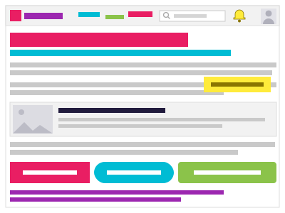
Before
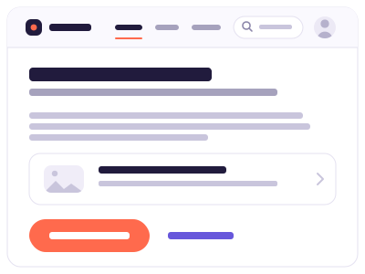
After
What is actually different
On the left the text runs right up to the edges. There is no margin, so the block feels like an overpacked suitcase. On the right there is air around it, and all that air does is give the eye somewhere to rest — which is exactly why it is often the first thing to be cut: it looks like waste.
On the left there are three buttons shouting equally loudly. So you have to work out for yourself what you are supposed to do. On the right there is one coloured button, and the second option is an ordinary link. You know at a glance what is expected of you.
On the left every element carries a different colour: pink, blue, yellow, green, purple. No single colour is wrong, but together they read like a toolbox that has fallen over. On the right there is one accent colour, and it appears exactly once: on the button you are meant to press.
Why this matters
It is not about pretty. It is about trust. Someone landing on your screen decides within seconds whether this is a serious place to leave their email address, their time or their money. That decision happens before they have read a single word of your text.
And it is about effort. A screen without a clear order forces every visitor to work out where to look. That costs them energy they would rather spend on your product.
Since you started building with AI, working code has become cheap. Something that works and earns trust has not — and that is exactly the difference you are learning to make here.
Three things you will learn
You will not become a designer, and you do not need to: you no longer draw anything, you describe it. That takes three skills, and we train all three.
- Seeing — the difference between 'it feels odd' and 'the heading sits as far from the text below it as from the block above, so I cannot tell what it belongs to'.
- Naming — in words an AI can act on. Ask vaguely and you get generic; the difference is your vocabulary.
- Judging — actually looking at what comes back, instead of accepting it because the code looks tidy.
- Look at the two images above again, but only at the buttons. Write one sentence about what happens on the left when you have to choose.
- Open a screen you built yourself — a page, a form, a dashboard. Look at it for ten seconds and write down what you see first.
- Now work out where you should be looking first. Are those the same things? If not, that is not a detail — that is the subject of module 2.
- Find a screen belonging to a company you trust. Count how many different colours are on it. The tally usually stays under four.
Stuck?
- I can see the difference but I cannot name it. That is exactly the starting point this course is built for — you are not supposed to be able to yet. Lesson 1.2 gives you four words that let you point at almost anything.
- Honestly, the left one does not look that bad to me. Then time how long it takes you to work out which button is the important one. That half-second of hesitation is exactly what your visitor has too, every single time.
- I have no screen of my own to look at. Use a form you filled in recently at a shop or a public service. What you are practising is looking, not building.
- My screen was built by an AI, so I chose nothing about it myself. Right — and that is why it looks generic. From module 6 you turn that around and hand the AI your own frame.
- What changed in the content between the two images?
- Why is one prominent button better than three equally prominent ones?
- Which three skills does this course train, and why is drawing not one of them?